
Stone Tile Flooring - Website Project
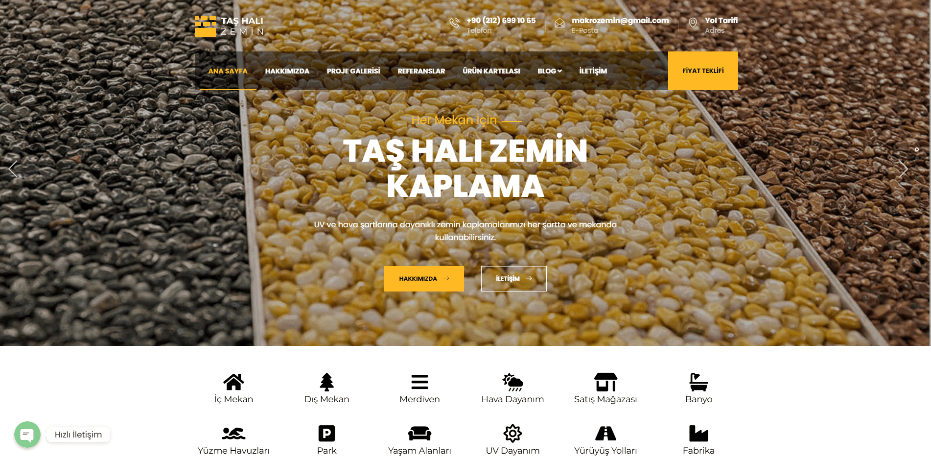
For Taş Halı Zemin, which blends the unique aesthetics of natural stone with cutting-edge technology, we built a visually focused, stylish web platform that guarantees results and invites users to a premium architectural experience.
%100 Mobil ve Tablet Uyumu
Kullanıcı Deneyimi
Premium ve Ferah Tasarım Dili
Arayüz (UI/UX)
Hızlı Fiyat Teklifi Dönüşümü
Etkileşim
Core Web Vitals Standartlarına Uyum
Performans
A Digital Reflection of Natural Aesthetics and Quality In the
flooring and landscaping industry, how a product is presented to the customer is just as important as the product’s quality. To convey the eco-friendly, durable, and stylish solutions offered by the Taş Halı Zemin brand to potential customers in the most effective way, we designed a modern interface that evokes a “premium” feel.
What Did We Do?
Premium and Airy User Interface (UI): We adopted a minimalist design language that is easy on the eyes and instills confidence, skillfully utilizing white space to highlight natural stone textures.
Seamless Project Showcase: We integrated custom gallery modules that are fluid, high-resolution, and won’t slow down the site, allowing visitors to examine interior and exterior applications in detail.
Seamless Communication and Quotation System: We designed user-friendly forms that allow both individual and corporate clients (such as architecture firms) to receive price quotes in seconds.
Mobile-First Experience: Anticipating that the vast majority of visitors would come from mobile devices, we created a 100% responsive design that functions flawlessly and feels just like a mobile app.
Result: Taş Halı Zemin now has more than just a website that showcases its products; it has a prestigious digital hub that demonstrates its architectural vision online, elevates its brand value, and consistently generates new business opportunities.
Challenge
There was a risk that the natural texture and color variations inherent in stone tile installations might appear faded or overly complex in an online setting. Additionally, it was necessary to establish a balanced tone that could appeal to both end consumers and B2B (corporate) architectural firms simultaneously.
Solution
We optimized loading speeds without compromising quality by losslessly compressing images. We developed a smart menu architecture that directs visitors to the right pages using clear categories such as "Individual Solutions" and "Corporate Projects."
Result
There was a significant increase in the time visitors spent navigating the site and browsing the project galleries. Thanks to fast-loading pages and clear calls to action (CTAs), the company saw a marked increase in the number of qualified lead requests it received.
Gallery
Ready to Grow in Digital?
Schedule a free strategy call to take your brand to the next level.